AD. For a while, my portfolio was full of social media graphics displayed on plain backgrounds, with nothing around them. I liked how neat the pages looked, but clients often needed an explanation of where those designs would eventually appear.
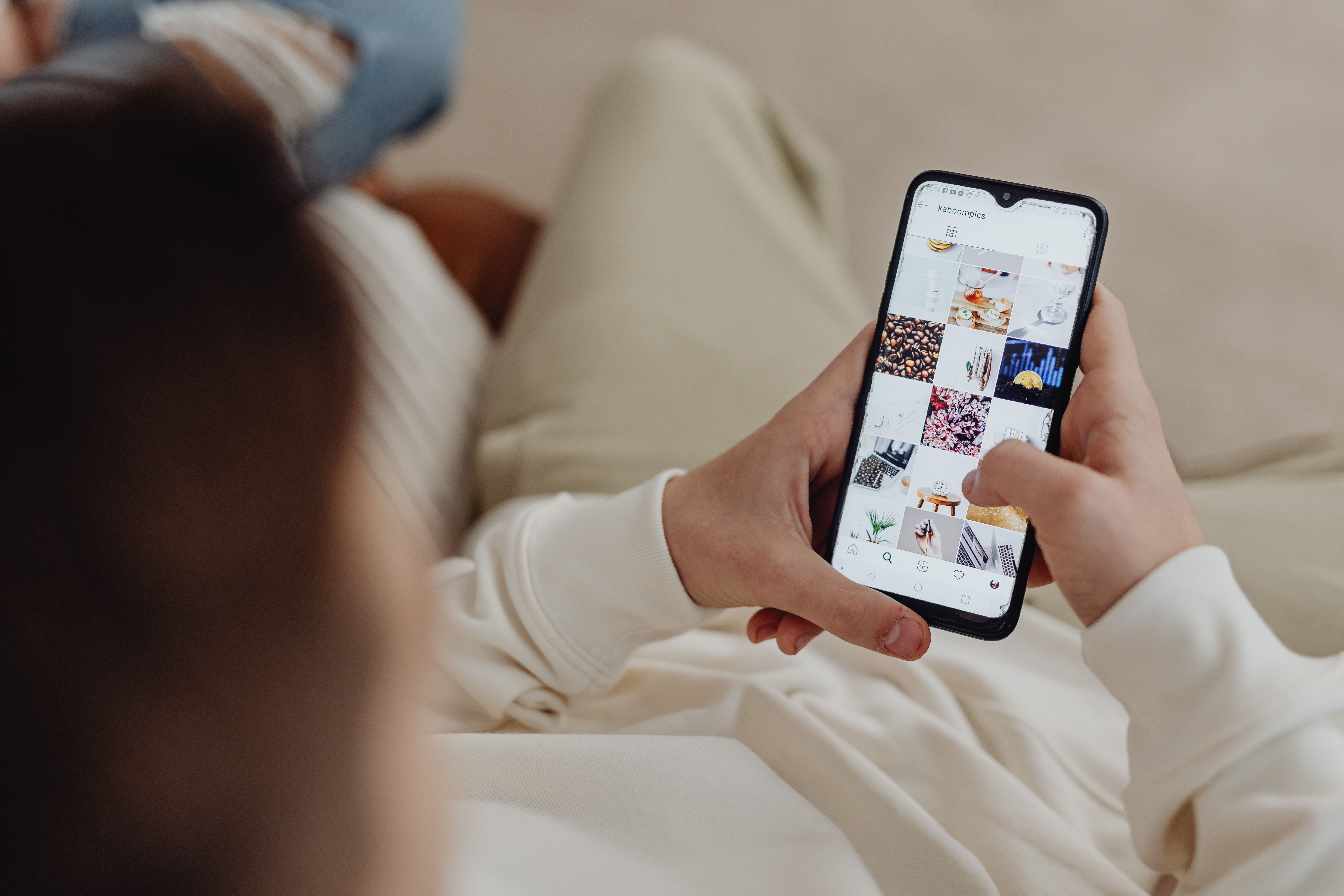
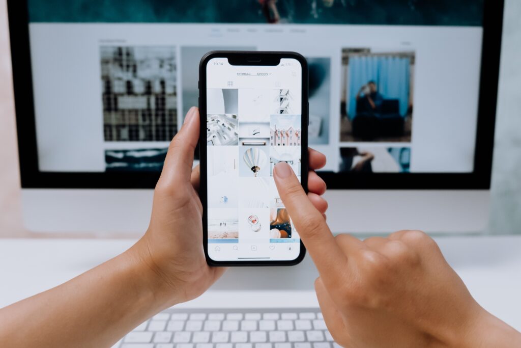
An Instagram post comes with plenty of visual baggage. There is a profile picture, account name, caption, and all the familiar buttons surrounding the image. On my artboard, I have complete control over what gets attention. Inside a feed, that control is more limited, and details I spent ages adjusting can become almost unnoticeable. These days, I prefer checking the work in its intended surroundings before deciding what belongs in my portfolio.
When I need a quick frame for that check, I sometimes turn to the Free Fake Insta Post Generator. It lets me prepare a post preview with the artwork and accompanying account details, which is useful when I want to review a composition without setting up an entire Instagram page. I keep these previews separate from actual campaign screenshots, especially when the work is speculative. I use it as a presentation layer, then label proposed work clearly. That distinction matters in a portfolio.
A Mockup Shows Me Problems the Artboard Hides
Typography is usually where things start going wrong. A headline can occupy a generous amount of space in Figma and still seem oddly insignificant when I look at the finished post at normal viewing size. Supporting text can turn into visual dust. A restrained logo can suddenly dominate the post. I catch those problems while building the case study.
Cropping has caught me out more than once. I can spend a surprising amount of time positioning a photograph, then discover that the composition feels awkward when I look at it without zooming in. Sometimes the image needs less empty space, or the subject has ended up too close to an edge. Sometimes I move a face inward or cut half the copy.
Mockups also expose repetition across a campaign. Four individual posts can each look strong while the set feels monotonous together. I have noticed this especially with layouts where the photograph changes but everything else stays in almost exactly the same position. After a few posts, it becomes difficult to tell whether the campaign has a recognizable visual identity or whether I have simply relied on one composition too often. That is usually when I start replacing individual layouts or removing pieces that contribute very little to the series.
Clients React to Context Before They React to Explanations
I have come across several cases when people respond differently to designs presented on a post on Instagram. For instance, those people who did not say a word about the original design are now wondering why the title takes so much space or how much should the price be visible in the image instead of wording it in the caption. After working with one design for hours, I stop asking myself a number of questions about the choices made. An outsider might see the drawbacks of the design that I would never notice because I have been looking at the same design for a long time. And considering the fact that we have access to Instagram interface, we can use it to illustrate our points without wasting time explaining what the finished post would look like like.
Logo placement is a good example. Clients sometimes want it larger, especially when the design has a lot of empty space. I usually prefer to check how prominent the branding already is once the account name and profile picture appear above the image. A bigger logo might help, but it can also crowd the product photography or compete with the headline. I have changed my mind about this more than once after seeing the complete post.
I Use Mockups to Edit the Story of a Project
One of the more frustrating parts of preparing a portfolio is deciding what to leave out. By the time I finish a campaign, I may have dozens of graphics, earlier versions, and small experiments saved in different folders. Some took considerable effort, which makes them particularly difficult to discard. But I have learned that including every variation can bury the stronger pieces.
This changed how I think about quantity. Earlier, I sometimes filled a case study because an empty section made the project feel small. Now I would rather show three convincing applications than nine repetitive ones. A realistic post frame gives those examples enough context to stand on their own.
I also pay attention to what a mockup accidentally claims. An Instagram preview can look convincing enough that someone browsing quickly might assume the post was actually published. That becomes a problem when I am presenting a concept that never made it past the proposal stage.
That rule matters when I build recurring content concepts too. I found this post useful because it looks at how repeated formats can become ongoing expectations. I think about a related issue when presenting design systems. Ten nearly identical posts can make a flexible system look rigid.
I sometimes get halfway through arranging a portfolio case study and realize I have designed the same kind of post over and over. A campaign might have plenty of attractive product images, all with short headlines and generous spacing. Fine, until I need to show how the design would handle a detailed announcement or a post explaining something more complicated. Suddenly, the typography feels too restrictive, and I have no idea where all that extra copy should go. I've had similar problems with campaigns built almost entirely around photography. What happens when the client needs to publish something without a decent image? I don't always go back and redesign the whole series, but I usually add a few variations to see how far the original idea can stretch. Sometimes I find that I was designing a collection of nice-looking posts rather than a system someone could actually use.
The Best Mockup Leaves Less for Me to Explain
I once spent an entire evening arranging six Instagram posts across a collection of phone mockups. Different angles, carefully placed shadows, a background that matched the brand colors. It looked good, but the actual designs were getting lost among all that decoration. I ended up removing most of it. These days, I usually keep the presentation fairly simple, although I still experiment when a project calls for something more interesting. I also try not to squeeze every design into the same Instagram frame. If I've spent days working on a custom illustration, I want people to see the details without having to zoom into a tiny post preview.
And I still find mistakes embarrassingly late. Last month, I could have sworn two campaign posts had completely different compositions until I placed them side by side. Same headline position, nearly identical image crops, even the spacing was similar. I had been so focused on the individual graphics that I hadn't noticed. That sort of thing sends me back into the design file when I should already be writing the case study. It's frustrating, especially with older projects where I thought everything was settled. But I'd rather have a portfolio with fewer examples I can explain properly than fill another page with work I haven't looked at critically in months.