AD. Picking the colour scheme for your house is as much fine art as painting from scratch because you want to create an interior design that speaks to you in a way that makes you feel welcomed at home. Interior designers are highly appreciated for their skills because they always seem to pair the right colours, and you want to achieve this level of knowledge because it's time to decorate your house. And if you don't want to hire an interior designer, you are determined to dedicate some of your time to studying colour theory so you can learn how to play with the shades and understand which ones work well together. It's essential to avoid some colour combinations in interior design, to enhance visual harmony because some hues demand too much attention, and when put together, they clash. You don't want to use two or more shades that compete for attention because the secret to a harmonious place is creating visual cohesion. Here are the combinations that you should stay away from because they make your house look chaotic, when put together.
[Photo by Jamie Quirke on Unsplash]
Warm vs. Cool
One of the most common reasons colours clash is a mismatch in temperature. Colours are generally categorised as warm or cool. Warm colours, such as red, orange, and yellow, evoke a sense of warmth and energy, while cool colours, like blue, green, and purple, give off a calming, relaxing feel.
Red and Green: Often referred to as complementary colours on the colour wheel, red and green should technically balance each other out. However, in practice, they often clash, mainly when both shades are highly saturated. The combination can be reminiscent of holiday décor, which feels out of place in everyday settings, so unless it's the intention to evoke this specific association, red and green can make a room feel overwhelming and busy rather than complementary.
Highly Saturated Colours
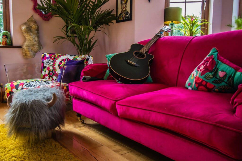
When two or more highly saturated colours are placed side by side, the result can be visually overwhelming. Saturation refers to the intensity or purity of a colour. The higher the saturation, the more vibrant and bold the colour will appear. Highly saturated colours command attention, and when multiple vibrant colours compete for focus, they can cause visual discomfort.
Electric Blue and Neon Orange: Both colours are intense and vibrant, so using them together can make a room feel chaotic and overstimulating. The clash is especially stark because blue and orange are complementary colours, meaning they sit opposite each other on the colour wheel. While complementary colours can create balance when one is muted, using them in their most vibrant forms creates a visual conflict.
Combining Analogous Colours in Wrong Shades
Analogous colours are those that sit next to each other on the colour wheel, such as blue and green or red and orange, and are generally considered harmonious because of their close relationship. However, even analogous colours can clash when paired in the wrong shades or tones. If you use these kitchen colours, the effect can feel awkward and unbalanced if the hues are too similar in intensity but differ slightly in temperature.
Mustard Yellow and Lime Green: While yellow and green are adjacent on the colour wheel, the earthy, muted quality of mustard yellow clashes with the bright, citrusy lime green. This particular pairing feels discordant because the colours evoke different emotional tones—mustard yellow feels warm and retro, while lime green is modern and energetic. The result is an off-putting visual dissonance that feels jumbled.
Neutral and Bold Colours Without a Middle Ground
Neutral colours like beige, grey, and white are often seen as "safe" choices for interior design. However, pairing a neutral colour with a bold, highly saturated hue can create an imbalanced look. The contrast between the two extremes can feel stark and harsh without a transitional or middle-tone colour to bridge the gap.
Bright white and dark blue: While at first, you might believe that this combination works well if you want to decorate in a classical way, the truth is that they would make the house feel too cold and crisp. If you prefer dark blue for your interiors, switch for a white shade that goes more towards grey to tone down the contrast between the two. Combining blue with grey makes your house feel elegant because the mix exudes depth. Dark blue is known for bringing a sense of richness and drama when used in interior spaces, and you can pair it with grey to add a sense of calm. Grey and nude tones will have a grounding feature in this context because they don't contrast with blue, as white would do, but rather intensify its characteristics. When you combine colours in interior design, you want to ensure they don't make the space feel overwhelming, but instead, they balance it and welcome harmony.
[Photo by Steph Wilson on Unsplash]
Too Many Bold Colours
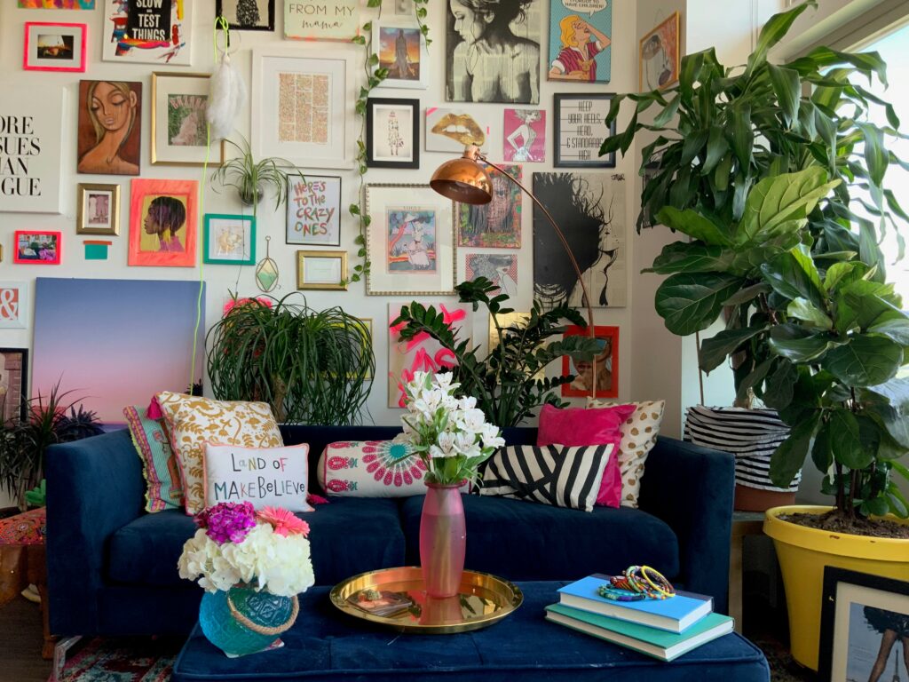
An interior space can handle a few bold colour choices, but using too many bold colours together creates a cacophony of competing tones. This overload of strong hues creates visual chaos, making it difficult for the eye to settle on a focal point. The result can feel cluttered and disorganised, even if the design elements are physically minimal.
Red, Yellow, and Blue: While these primary colours are foundational in art and design, using them all at their most intense hues in the same space can feel childish and chaotic. Each colour demands attention, leading to a sense of competition and disorder in the room. The space can feel overwhelming without a balancing neutral or subdued tone to break up the vibrancy.
Pastels and Neons
Pastels are soft, muted colours, while neon colours are bright and intense. Combining these two extremes can create a stark contrast that feels mismatched. Pastels evoke a sense of calm, subtlety, and softness, while neon colours are bold, energetic, and attention-grabbing. The clash between pastel and neon colours can be too jarring without a middle tone to transition between these extremes.
Soft Pink and Neon Green: Soft pink is often associated with tranquillity and elegance, while neon green is vibrant and loud. Together, the contrast is too extreme. The pastel pink feels washed out next to the neon green, and the green feels too overpowering next to the soft pink. The overall effect is disjointed and lacks cohesion.
Extra colour combination
Gray and warm colours: If you love the Scandi-style aesthetic, then you should paint the walls in grey shades because the hue is the ideal backdrop for the trend. However, you should know about grey that it doesn't go well with warm colours, and it's best to look for an alternative. If you want to create a warm and inviting space, you should paint the walls blue and combine them with tones of magenta and burnt orange. Bringing the three hues together in the same space makes it look more energetic and upbeat.
What you should keep in mind
In interior design, colour harmony is key to creating balanced and cohesive spaces. While colour clashing can be used intentionally for dramatic effect, most successful designs rely on colours that complement rather than compete with each other. Understanding the principles behind why certain colours clash can help designers avoid common pitfalls, creating aesthetically pleasing and comfortable spaces.